State of Ohio
Design System
Client
The State of Ohio - DAS
Role
UX Visual Designer
Services
UX / UI Design
Accessibility Compliance
Frontend Development
Duration
2023 – 2025

The Challenge
The existing State of Ohio's UI component library had become outdated, fragmented, and insufficient for the growing digital needs of the state’s various agencies. Over time, independent design and development efforts led to significant inconsistencies in UI patterns, accessibility compliance, and overall user experience across the statewide ecosystem.
Many agency teams were forced to reinvent UI components from scratch due to the lack of a centralized, well-documented, and modern design foundation. As a result:
- Brand cohesion was lost with divergent visual styles, typography, and layout systems.
- Accessibility risks emerged with numerous components failing to meet WCAG 2.2 standards.
- Development time increased as engineers rebuilt similar elements without reusable resources or clear design guidance.
- Mobile and responsive behavior was inconsistent creating friction for end users—especially those relying on assistive technologies or mobile-first access.
The challenge was not just visual — it was systemic. We needed to create a comprehensive, scalable, and accessible design system that could unify the digital presence of all agencies and establish a trusted single source of truth for UI design and development across the state.
My Role & Responsibilities
As part of a cross-functional team, I was responsible for:
- Conducting UI audits across agency websites and applications
- Establish foundational style rules and guidelines
- Redesigning existing components for visual and functional consistency
- Creating new components based on actual user and agency needs
- Defining component interaction behavior and responsive states
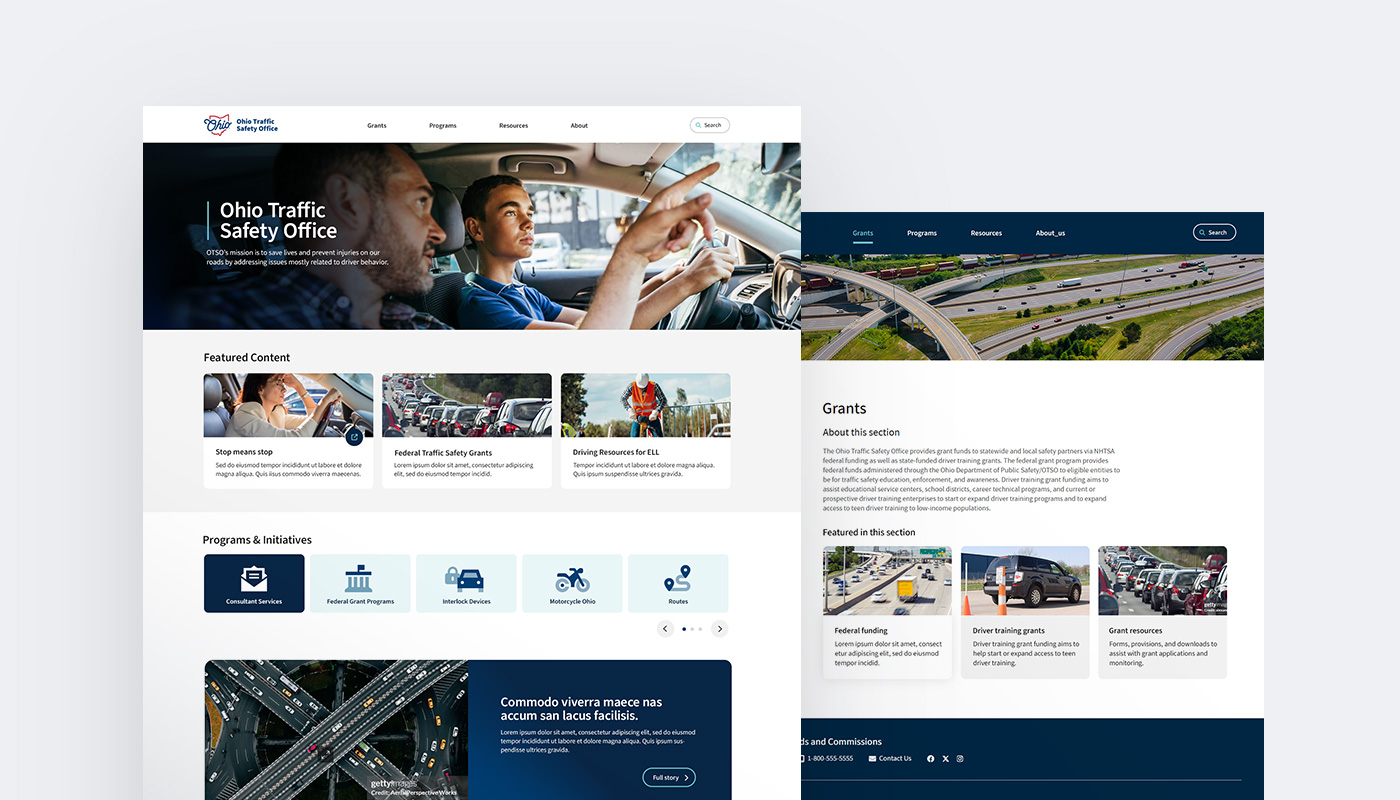
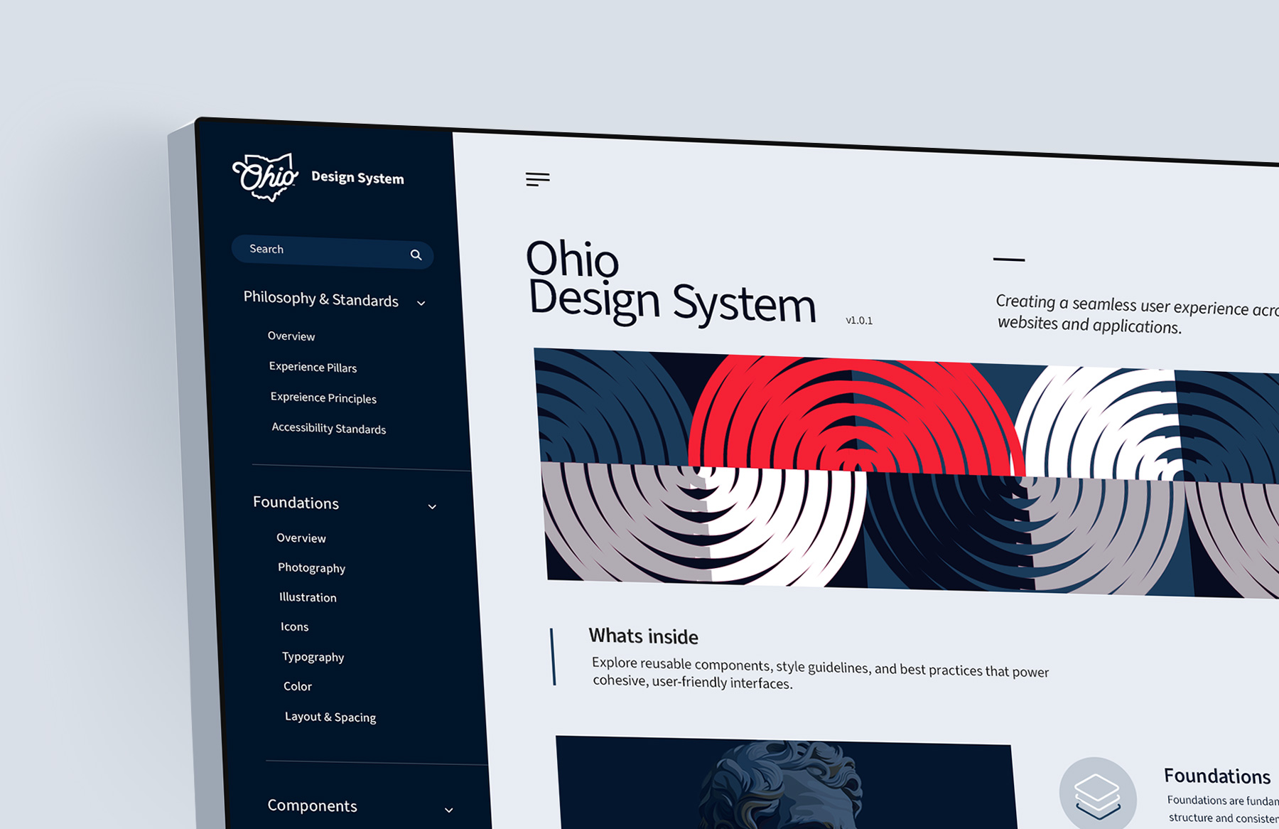
- Visual design of the new React Storybook Design System web app
- Collaborating with developers on handoff, documentation, and build standards
- Contributing to the design system site documentation
Phase 1
Phase 2
UX & UI Design Process
Phase 1
1. Component Audit & Pattern Analysis
- Identified redundant or misused components across agency sites
- Mapped inconsistencies in typography, spacing, color, buttons, and form fields
- Compiled a list of all 'base-level' elements and components essential to building our first proof of concept websites
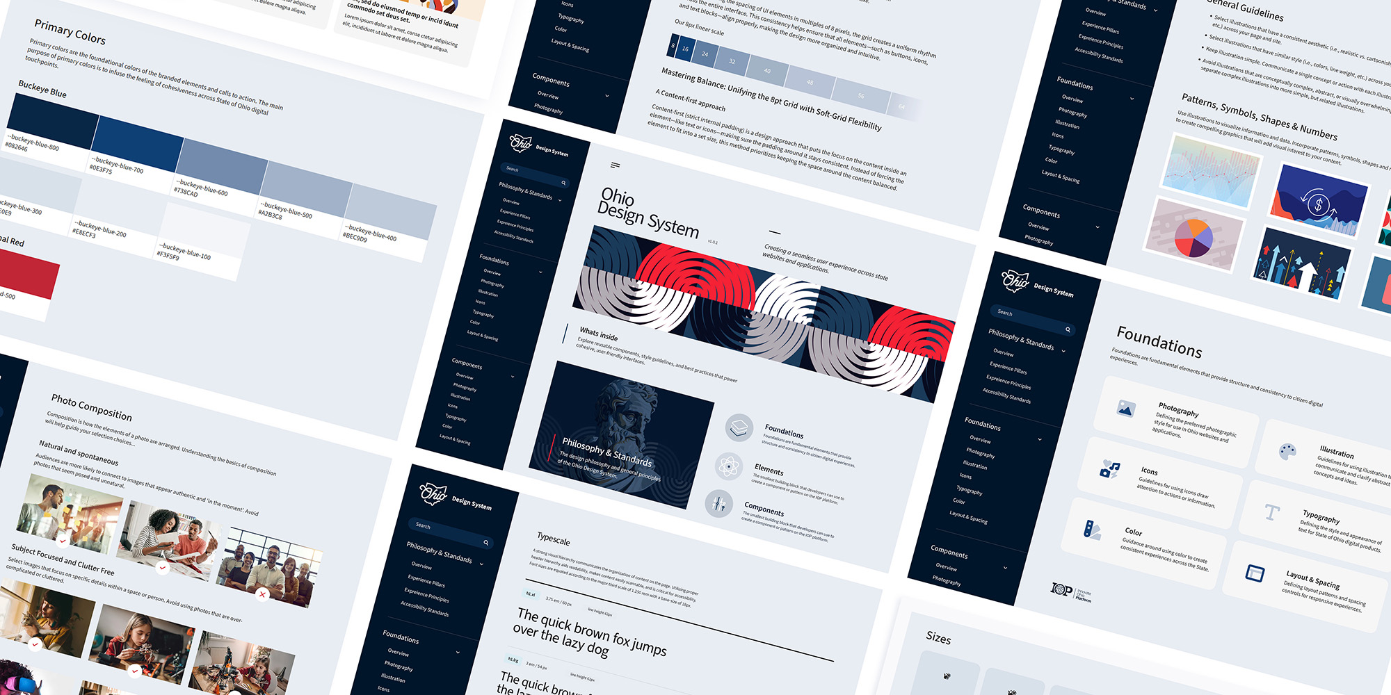
2. Visual Style Guide
- Established foundational style rules:
- Typography scale
- 8pt spacing system
- Extended color palettes with ADA contrast pass
- Photography and illustration guidance
- Iconography system
3. Component Design
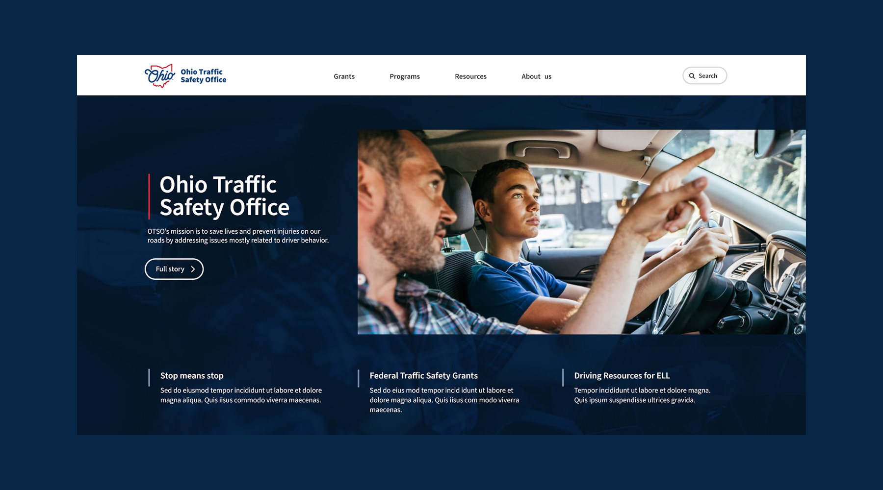
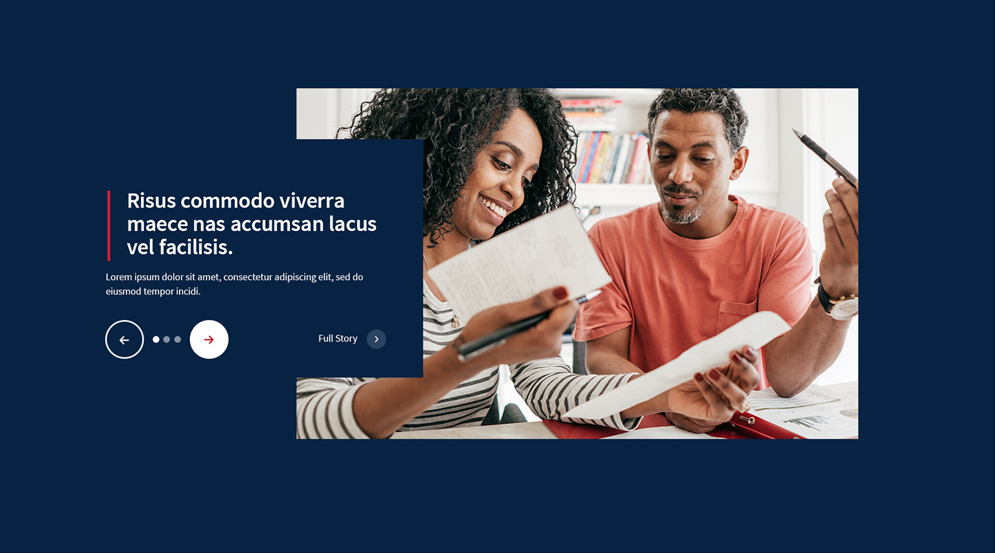
- Following atomic-design methodology, I designed and documented over 50 scalable UI elements, components and patterns including:
- Navigation: headers, menus, tabs, breadcrumbs
- Content: Banners, cards, tiles, tables, modals
- Forms & Inputs: buttons, dropdowns, toggles, accessible inputs, date pickers
- Media: video players, image sliders, photo galleries
- Feedback & Status: alerts, loaders, validation messaging, status indicators
- Layout templates: landing, secondary & tertiary pages
- Each component was designed in multiple variants to accommodate different content needs, interaction states, and device contexts.
4. UX Guidelines & Functional Specification
- Developed use-case-driven specs for all elements and components
(e.g., Button: Primary, Secondary, Disabled, Icon usage) - Defined functional rules for complex components (modals, dropdowns, accordions) to guide development and reduce ambiguity.
- Established accessibility guidelines (color contrast, keyboard navigation, ARIA roles) to align with WCAG and Section 508 compliance.


Phase 2
5. Dev Collaboration & Documentation
- Formatted finalized component designs into UXPin, creating interactive prototypes with developer-ready build specifications to streamline handoff and ensure design accuracy.
- Created documentation that included usage rationale, do/don’t visuals, and accessibility notes.
- Supplied hand-coded HTML/CSS component builds as reference for developers, enabling efficient conversion to reusable components within the frontend framework.
- Reviewed live builds for pixel accuracy and interaction consistency.
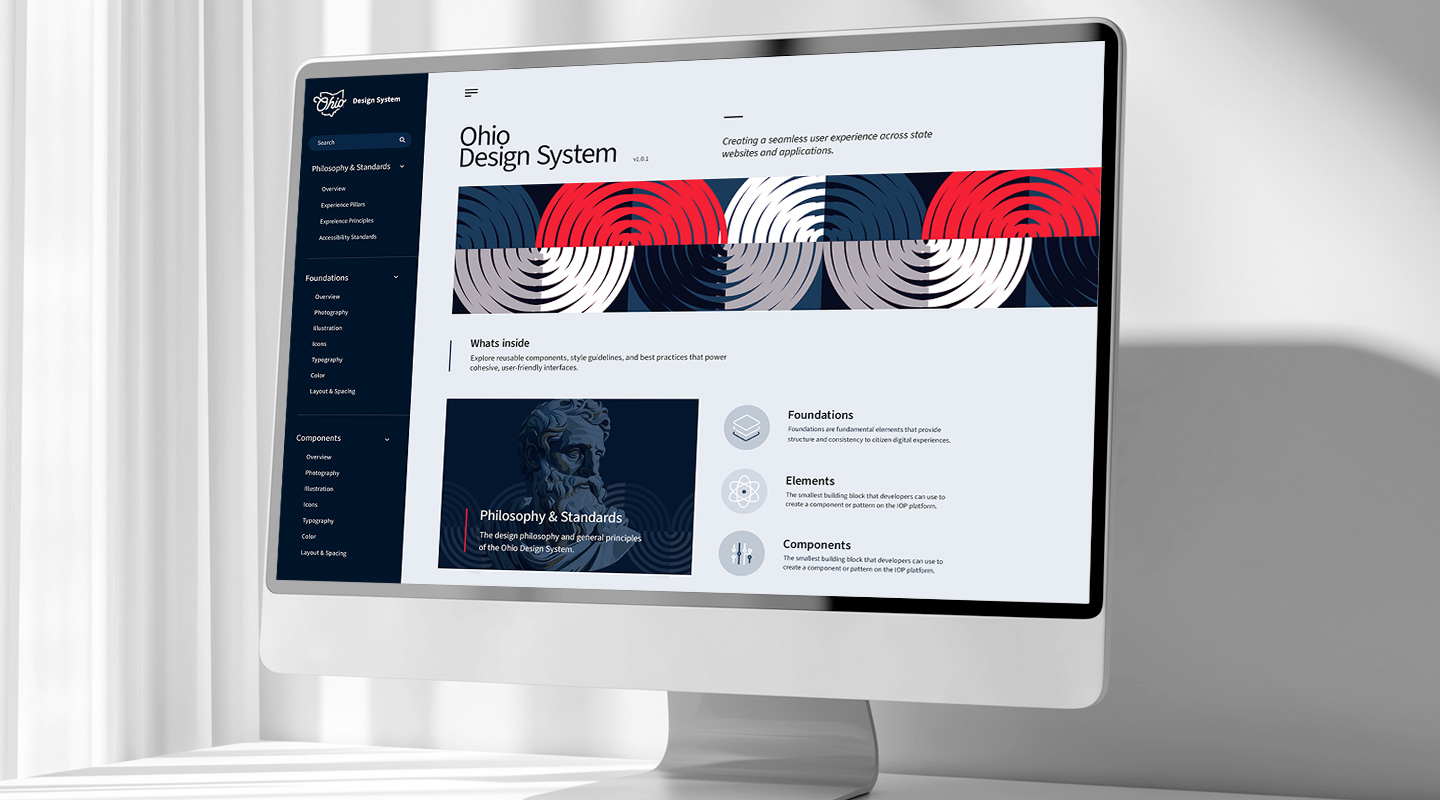
6. Visual Design for the React Storybook App
- Led the visual design and customization of the React Storybook Design System application, ensuring a cohesive and modern user experience.
- Designed and developed the application’s landing page, establishing the visual tone and design direction for the system.
- Designed and developed section landing pages and tertiary-level pages, applying consistent layouts, typography, and interaction patterns.
Outcome
& Results
- Successfull launch of the State of Ohio Design System application
- 50+ design system components implemented across state agency websites and applications
- Improved accessibility scores
- Set a foundation for the headless CMS migration and future expansion
- Accelerated dev time with a shared UI library and single source of truth
Key Takeaways
Building a statewide design system taught me the importance of designing for scalability, clarity, and cross-functional collaboration. It reinforced that great systems don't just look good — they empower teams to build consistent, inclusive experiences at scale.